So far we've now completed a rough cut which will be uploaded shortly and are gathering clear ideas about where the poster and ident are going aswell as the magazine article. Over the christmas holiday we're both reading editions of Little White Lies, our chosen Arthouse film magazine and are compiling ideas from our experiences. We're getting much closer to deciding on our ident and finalising our logo and film name so that our company branding is clear and can then be incorporated into the poster and magazine article. We've chosen Little White Lies over a bigger company such as Empire because we believe our film with it's clear motifs and simple, social realism setting is better suited to a company like Little White Lies, which is still only getting off the ground itself at the moment.
In the next few weeks we are aiming to start completing our construction side now that research & planning is finished we feel we are ready to complete any re-takes needed with our actors and clarify with our teachers and audience research precisely what it is we need to do next. In the first week of January we will be recording with our pianist Cameron who we have now briefed and will be shown the film soon.
Friday 20 December 2013
Wednesday 18 December 2013
Arthouse Film Idents
Film Idents vary in style and length, very often to suit the film they're working with, several of the idents below for example, use a timeless effect either by using scale and themes such as the earth or the brain, others including a variety of characters and locations to show the proportion of the company. Other companies use a very simple technique and logo, often when they're starting off.
The most important thing in a film ident is the logo, to have company success, you want your audience to recognise your logo, each of the ident's below has a very clear logo that always comes at the end of the clip. Length's vary from 5-17 seconds depending mostly on the wealth and popularity of the company. Often ident's change with wealth & popularity, effects such as 3D animation are used to do this.
Unless and ident only deals with a certain genre such as Film Noir or Thriller, it's important that they can apply to any film, this most often comes through simplicity, which all of the ident's have, we may not know precisely where we are or what's happening but we get an excellent sense of the type of company.
CURZON FILM WORLD
This ident gives a feeling of knowledge and being central to events, the abstract computerized object looks rather like a brain or some kind of control centre, in it's background is a large spherical object, resembling earth. This makes us think of scale and innovation, the sparks of the maze suggest a hint of new things to come from this company.
BLUE HEAD FILMS
This ident is very short and simple, it goes from a very modern, technical looking pixel screen that transforms into a tribal design face and bold, simple lettering. Giving the effect of old and new combined to create one another.
SNASK FILM
This longer ident, gives a sense of money, it's very high definition and set-up very cleverly with smoke and lights timed precisely so we almost can't make out what the company is called. The black and white palette makes the film feel very timeless and gives a sinister edge when combined with the sound effects and background noise.
ENTER FILM
This ident immediately says comical from it's soundtrack, there is a business and liveliness to it, especially using the bright yellow and film noir silhouette look. The transition between so many locations and characters suggests a longevity and variety within the company that may be attractive to any viewer.
A1 FILMS
This ident is the shortest of the one's I've viewed, it very simply animates the company logo with a bright sun like light in centre. The fade of the light and very simplicity of the logo gives it an innovative feel, like the birth of a new era or company, there is something not yet formed in the simplicity. The colour palette is also quite egyptian, it feels like a hot sunrise and the lettering is timeless.
SEVEER FILMS
The several version of the one ident shown in this video allow a look at how some more well established companies have changed their ident's over the years but stick with the same logo, often to suit the film it's used in, or to give a different impression to the audience. The last ident for example, shown on the preview screen above is in full 3D with a red-hot iron stamp as the f, suggesting that the company is making its mark, or possibly already has. This version is far glossier and more hollywood than the 2D versions shown in the first edition which includes it's website at the end of the ident. This progression is a sign of wealth and popularity within the company, they no longer need to put anything other than the logo in their ident. Large conglomerates such as Universal and Disney are able to do the same with their idents.
ENTRACTE FILMS
This very simple ident is replayed several times here using slightly different colour schemes, this company made films mainly in the initial use of colour cinema, it's a retro feel today and you can imagine it being used with an 'old film' effect on the computer. There is a sense of that 70's/80's new generation technology. The music especially is one of the first computer generated soundtracks used in film idents.
HH
After having looked at several idents and analysed their success it's becoming clear that for a first film with our company the ident should be short and succinct, focusing most importantly on our logo and film company name.
HH
Tuesday 17 December 2013
Updated Poster
I have updated the mock poster using the feedback that I gathered though Facebook, addressing as many of the problems as possible.
I also asked 2 graphic designers their opinions on how the poster could be improved purely for aesthetics as I felt there was something not quite right about it.

Most of the changes I made were quite subtle:

I am now much happier with the aesthetic of the poster since it is much more in the style of Saul Bass posters/title sequences or Pixar title sequences like Monsters Inc and The Incredibles. If we were to use this as our main poster I would want to update it once again to help improve how easy it is to understand. To do this it must reference the film more than it does, this can be done using stills from the film or a tagline.
TB
TB
Monday 16 December 2013
Audience Feedback on Possible Poster
I sent a picture of my mock poster to a range of people via Facebook to gather feedback. I asked them to roughly answer these questions:

These were some of the answers I received:


1. Most people noticed the red background first - this was good as the red background was intended to catch people's attention and make it stand out.
2 + 3. Mixed opinions some said they like the font and the harshness of the figures, others said that this was exactly what they disliked about the poster.
4. Everyone liked the style overall except for one person who said that though they did like the simplicity they did think it was maybe too harsh.
An issue that a few people mentioned was that the poster didn't really give any clues as to what it was about, in other words they didn't really understand it. I feel this is the main point that needs to change as it is extremely important that the poster draws people to see the film and to do this people must understand what it's about.
TB
Possible Poster
I created a mock poster based around one of my sketches on Adobe Illustrator. The poster is a rough version of what could be our final poster if we wanted to do a more linear style and design. This was based around Saul Bass' Anatomy Of A Murder poster in terms of both colour scheme and style. I was able to quickly put together this poster being already familiar with the program Adobe Illustrator, doing this has given me a better idea of what a poster in this style could look like.

The TYPEFACE was difficult to come by as most of the fonts available in Illustrator were too modern and clean-cut and therefore clashed completely with the style of the poster. I thought back to the Anatomy Of A Murder poster and other posters from around this time and realised that many had hand-cut typefaces. Being unable to find a downloadable font of this style I ended up drawing the font straight into Illustrator using similar ones to refer to. I decided that I liked the mixture of upper and lower case and so would incorporate this into it.
The COLOUR SCHEME was based around the Anatomy Of A Murder colour scheme with the neutral background contrasting with the bright red block and black type and figures. I thought it was important to have a border around the poster as it suits the style.
The FIGURES I tried to make look fairly abstract, whilst keeping the linear style. It was important that the figures kept a balance between looking disassembled but still obviously figures.
The RUBIK'S CUBE was aimed to be the centre of the poster where the eye is drawn to, I am not entirely happy with the distribution of the colours in the cube, but this could easily be altered if we decided to develop the poster.
I have left space for the BILLING BLOCK at the bottom of the poster.

These are the different layers I used to build up the poster that was made up of many different components. By using locks on the different features and layers it made the process of making the poster much more efficient.
TB
Thursday 12 December 2013

Specific Stills Analysis
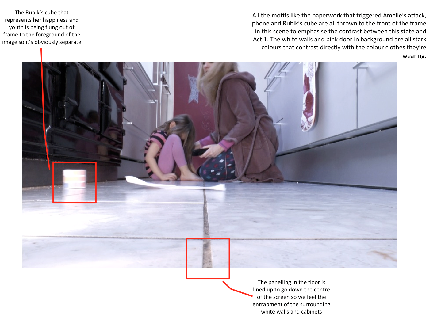
The shots in the film are largely composed to represent and symbolise making the film less naturalistic and more expressionist to show themes and motifs clearly. For instance the key components of this shot rush out of shot to emphasise what is happening in the narrative.
HH
HH
Wednesday 11 December 2013
Poster Sketches
I have done some very basic sketches for 6 different poster ideas:
Quite a convention poster using a photograph that would need to be taken - there are no production stills of this kind. Photoshop would be used to change text on the boxes to titles and credits.

Based on Anatomy Of A Murder poster by Saul Bass. Sole use of graphics that are quite abstract and very simple. Quote from Saul Bass on his method for poster design is on the image above : "Simplify & Symbolize", this is what I have tried to do here.

One of our initial ideas based upon Eadweard Muybridge's "Nude Descending A Staircase".

The Marcel Duchamp version of "Nude Descending A Staircae", again one of our initial ideas.

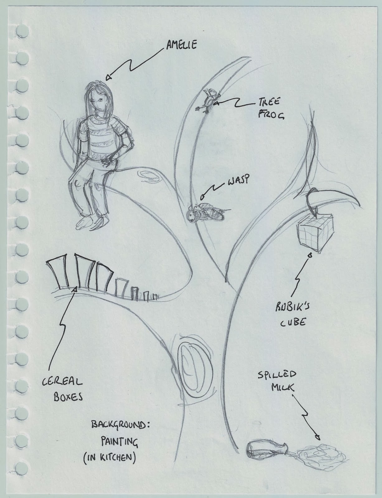
The final of our initial ideas using the tree collage of 'an autistic brain' however tailored to our film.
An extremely conventional style of poster however with the cereal box separating the characters to make it slightly more interesting. Photoshop would be used to add titles and credits to the cereal box.
TB
Tuesday 10 December 2013
Graphics & Titles Planning

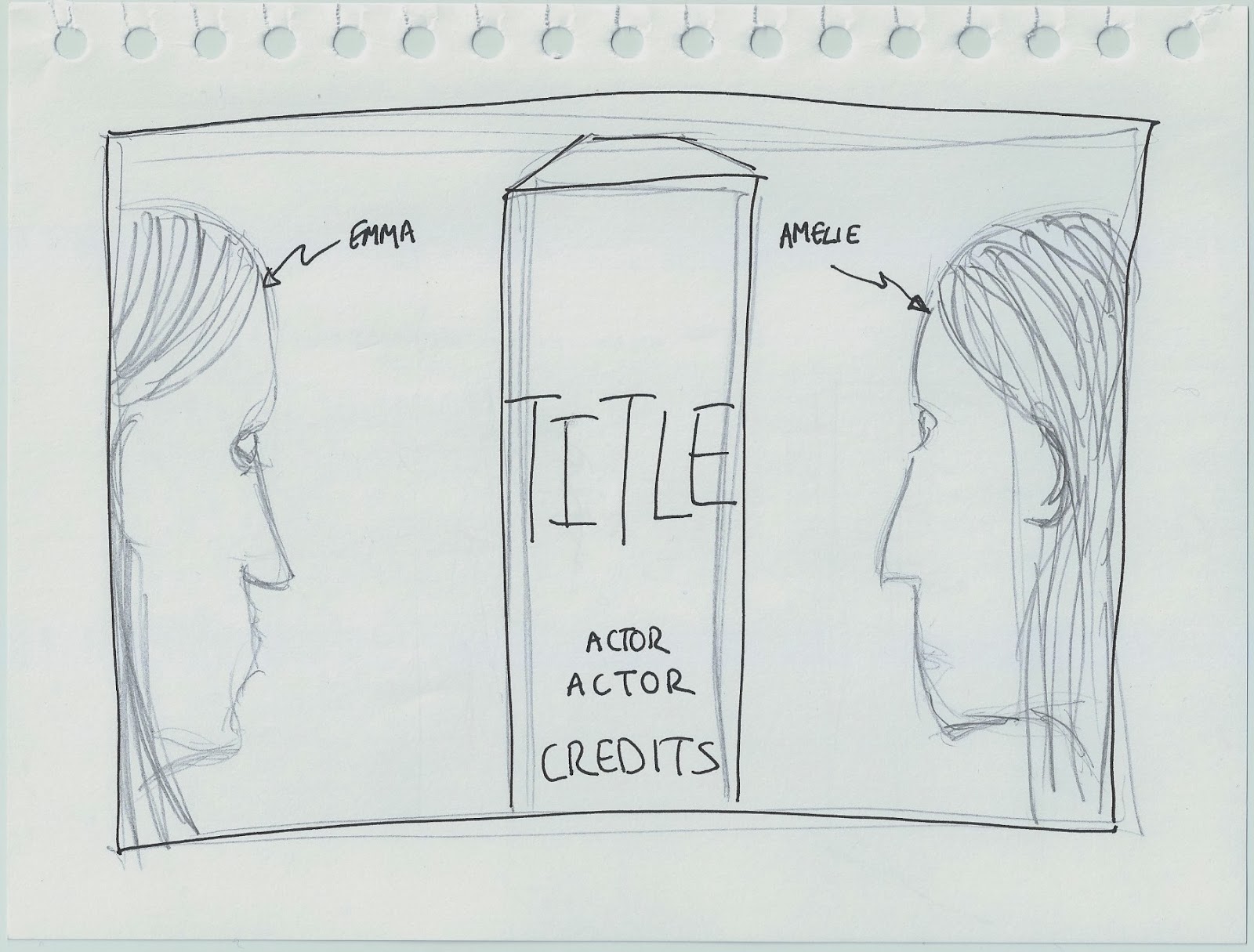
I did a short test for a way of incorporating the credits into the objects within the shots. This test shows the actors name of Amelie on the cereal box when she is sitting behind out of focus.
I constructed this using Motion Graphics for a Final Cut Title. I had to match the colours of the text to try to make it look as if it could actually be printed onto the cereal box. If we used this technique for our actual credits in our short film we would also have to use motion tracking to compensate for the slight camera shake, as this test shows the cereal box moves slightly whilst the text stays still. If this were the real thing I would also like to get the text to move with the box as Amelie pours cereal from it.
In motion I had to cover the original text on the cereal box with 2 shapes which I matched colour to the brown on the box. I then layered the text of the actors name over the top of the shapes and tried to make it look as similar to the rest of the text on the box as possible. Layers were key to use as they determined what was visible in the final test.

TB
Saturday 7 December 2013
8 | So Far
We have decided on a name for the film finally, we are planning sound, graphics and the ident whilst editing the rough cut of our film. We are editing the first cut exactly the storyboard/shot list. We are planning posters and a magazine article for the film and plan to have finished our entire research and planning section swell as a rough cut by Friday 20th December.
Friday 6 December 2013
Poster Survey Results
We took a survey of these questions on 5 film posters that we felt not only represented a mix of genre's but mainly adhered to our preferred style. We are producing a social-realist/art-house film and the poster obviously should represent this. This research, influences from the film and titles research will combine to inspire the final movie poster and furthermore the magazine article style.
Thursday 5 December 2013
Graphics Research

These graphics work well because they add depth to the shots, they are extremely simple, and the addition of the names of the objects in the shot is quite different and interesting.
A similar style is used in the film Stranger Than Fiction, the titles are more complicated however but are used similarly in an interesting way that relates to the film.

Gattaca has an extremely minimalist title sequence using a very basic blue colour palette and straight-forward which titles in a generic font. The style fits well with the film which is very sleek, minimal and simple, this title sequence is a perfect example of how the titles much fit in conjunction with the style of the film itself.

This is the famous Saul Bass title sequence for The Man With The Golden Arm. The use of the bars across the page work with the film since the bars are all skewed and disjointed, a reflection of the narrative of the film. This gave me an idea for our own titles as on the other hand to The Man With The Golden Arm, our film is a lot about the symmetry of some shots, therefore it could work for us to use bars in a similar way except have them all horizontal or vertical to highlight the symmetry.

Finally these are some titles created by Danny Yount for Semi-Permanent Portland. The graphics are beautifully composed and work well by intertwining themselves in with the objects within the shot. They also use lines and reflections to highlight the geometry and perfect symmetry of each shot. The titles themselves are fairly simple and use a modern typeface to match the style.


Having researched these different title sequences I feel that it will be important for our titles to work with the objects in the shot, rather than just look as if they have been stuck over the top. This will give the film a more professional look as well. Also I think it is vital that we use the titles to help our shots look composed and symmetrical, this was the aim for a lot of our film and rushing the titles with actually make the shots look worse.
TB
Monday 2 December 2013
Poster Research Survey


- What is the first thing you notice about this poster?
- What genre do you think the film is & what gives it away?
- What do you like about the poster?
- What do you dislike about it?
- How much of the narrative does it give away?
Iconic Film Posters
Nowadays Hollywood churns out at least 10 posters for every film released ranging from the main poster to character posters to teaser posters. However it used to be that 1 poster was produced for a film and was treated more as a piece of artwork than just promotion. This is why many older film posters are more artistic and in my opinion are far more effective, compared to more recent posters which are edited photographs more often than not.
This is a small collection of some of the most iconic film posters of all time:

This poster for Hitchcock's Vertigo was designed by Saul Bass in 1958. The poster is based on a simplified two-colour process that uses hand cut lettering against the orange background. The only figures shown are the hand-drawn figures of James Stewart and Kim Novak. The film on its release was seen as slightly outside the Hollywood normal, more edgy and physiologically complex, this is reflected in the poster through the typeface and abstract graphics.

Perhaps THE most iconic poster of all time is the Jaws poster designed by Roger Kastel in 1975. Through one image the poster manages to exploit the audience's fear of the unknown - what is beneath them in the sea. The combination of the blood-red type, thick border and size of the shark in comparison to the girl all add to the impact of the poster. However undoubtedly what makes this poster so great is the impression it leaves on the audience before they have even seen the film, it is truly unforgettable and therefore is so effective.

Stephen Frankfurt's poster for Downhill Racer in 1969 is not seen widely a particularly iconic poster, however in my opinion it should come close. The use of negative space below the up-close photo of these two characters makes for a powerful poster, plus the subtle skier in the centre. These basic elements of the poster manage to sum up the rough plot of the film in a very simple but effective way. The title noticeably does not fill all of the negative space, it is consciously smaller than what would be expected. This can happen because the top half of the poster manages to draw the audience in so well that it draws the eye down to the title at the bottom.
These are some more of the many iconic posters that leave such a mark on their audiences that they can draw almost anyone to see the film:


Thursday 28 November 2013
Title Possibilities, Themes
We have created a picture & wordle inspiration to come up with our film title which is currently unnamed. To create the wordle we entered our blog URL into wordle and it sourced all the words in our blog, coming up with these key words. After much deliberation I came up with the idea of PaperWeight - the phrase references several moments in the film and the relationship that is the centre of it. A paperweight holds down and restricts what it rests upon as Amelie does with Emma it also refers to the hectic lifestyle Emma leads and Amelie's obsession with tidiness and neatness.


We also looked at this article that seemed particularly relevant to our film and character, I enjoyed it and found it helpful in understanding. http://www.theguardian.com/lifeandstyle/wordofmouth/2013/dec/10/child-fussy-eater-what-not-to-say-dinner-table

Thus the film was called
PAPERWEIGHT
Wednesday 27 November 2013
7 | So Far
The way we've chosen to edit is that we will work separately, Theo is doing the first rough cut and shaping it into a 5 and a half minute piece, I will then take over and edit it to a close cut, we will then together work on the final cut with advice from audiences and colleagues.
Our reasons for doing this are that we want to give as much fresh attention as possible, always when editing a film you notice and pick up things that a first time-viewer might not realise or appreciate. We plan to utilise the fact that we're a pair by not jointly editing, we feel it may also be less time efficient, trying to edit together and possibly having contrasting opinions would mean we spend longer debating on what would be the right decision when in fact by editing separately we can build on each other's ideas more effectively.
Our reasons for doing this are that we want to give as much fresh attention as possible, always when editing a film you notice and pick up things that a first time-viewer might not realise or appreciate. We plan to utilise the fact that we're a pair by not jointly editing, we feel it may also be less time efficient, trying to edit together and possibly having contrasting opinions would mean we spend longer debating on what would be the right decision when in fact by editing separately we can build on each other's ideas more effectively.
Monday 18 November 2013
6| So Far
We've been working solidly now for over 2 months on the short film and have finally filmed, we're working on a rough cit, film titling, graphics and sound at the moment, combining everything we've learnt in the last year to create a good post-production plan. We've set a deadline of the 13th December to have all planning & research done as well as a rough cut. So far, the footage we've watched is good but there are a few shots we could do with spending longer on.
Wednesday 13 November 2013
Saturday 16th November | On Set
We are filming on Saturday 16th November, we have hired out:
- 2x Panasonic HD Cameras
- 2x Tripods
- 1x Dolly Wheels
- 1x Boom Pole
- 1x Stereo Mic
- 1x Directional Mic
- 1x Microtrack
- 1x Headphones
- 2x Kaiser Mains Lights
- 2x Light Filters - Day Blue Colour
- 1x Clapperboard
- 1x Light Stand
- 1x Nikon SLR
We plan to use all the equipment and get the actors to help us during the production, we will both film as much as possible to try and get a range of shots, as we are using a child actor we want to capture as much as possible of what she does incase there is anything unexpected we want to use. One camera will film the shot list and the other will travel with one of us, filming form angles and compositions we can improvise at points along the way. It's not a necessity that we film with two cameras but we feel hopefully it will add any fillers we need.
The lights will create an added effect specifically to the scene in the kitchen when we want to feel white around Amelie, the lights also provide the cold white colour we want, especially if the weather is overly dark on the day of filming, although the weather forecast is set to be clear.
We will try to take stills throughout the shooting day in attempt to capture a cover/poster photo that might be suitable.
We will try to take stills throughout the shooting day in attempt to capture a cover/poster photo that might be suitable.
Tuesday 12 November 2013
Filming Schedule
We are filming from 9am - 3pm on Saturday 16th November at Theo's house. We are setting up shots and props from 7.30am so that when our actors arrive at 9 we will be ready to film.
We plan to spend roughly 2-3minutes per shot. We divided 5 hours (our filming time) by the 140 shots we have and have produced an average 2minutes per shot. Although this is very tight we have planned meticulously and by sticking to the schedule we should be able to get some shots done in only a minute and others in a longer time.
9am - 12am
The Build up to and Fit from Shot 60 - 117
12am - 12.30pm
The End of the Film from Shot 118 - 139
(whilst Amelie has Lunch)
12.30pm - 1.55pm
Opening Stair Shots from Shot 1 - 11
(whilst Rachael has Lunch)
1pm - 1.30pm
Beginning of Act 2 from Shot 46 - 59
1.30pm - 3pm
Act 1 from Shot 12 - 44
Saturday 9 November 2013
Props
For our film, we need
- a completed Rubik's cube
- remote control
- dressing gown
- house phone
- cereal bowls/cereal/milk
- coffee machine
Thursday 7 November 2013
Sound Design
http://www.askaudiomag.com/articles/complete-beginners-guide-apple-logic-9-part-1
Over the last few days I've been exploring Logic music software and learning basic sound development techniques so that when we come to complete our sound we will be able to edit sufficiently and won't be held back by our technical knowledge/limitations.
The program allows you to combine recorded sound with computer generated sound which is what we were hoping to do. It also gives us full control of the sound that we record.
We have also decided that we need to be clearer about how we want our sound to be in advance of recording with Cameron. We will still take some blind recordings from him but after a few takes we will show him some examples, samples and information about the kind of sound we want. In the next few days I'm analysing film music and mainly cross diegetic music which is a kind of enhanced diegetic sound, aided by non-diegetic SFX.
This source is a research & experience essay on sound in film, it analyses several examples and adds tips to the examples. There is also some tips on technique that could come in very useful for our filming in the next week.
http://www.filmmusicnotes.com/diegetic-music-non-diegetic-music-and-source-scoring/
Wednesday 6 November 2013
Introduction to Non-Diegetic Sound
Sound whose source is neither visible on the screen nor has been implied to be present in the action:
- narrator's commentary
- sound effects which is added for the dramatic effect
- mood music
The distinction between diegetic or non-diegetic sound depends on our understanding of the conventions of film viewing and listening. We know of that certain sounds are represented as coming from the story world, while others are represented as coming from outside the space of the story events. A play with diegetic and non-diegetic conventions can be used to create ambiguity (horror), or to surprise the audience (comedy).
Another term for non-diegetic sound is commentary sound.
In common film music and soundtrack - a producer and director will hire a composer and sound producer to create sound based on information and research that the director/producer provides for inspiration and style. They will attach a storyboard and give clear structure to the sound and when its needed. It's important that if the sound is being created before the film is made that the story and style is very clear so that the wanted effect is created.
With our film we feel it's important that the non-diegetic sound doesn't add all the emotion to the film but that it's an aid. You should be able to watch the film and understand it the same way you would with non-diegetic sound.
Good examples of non-diegetic sound being used and natural sound being enhanced are in my studied short films such as White & Apricot, the sound is very much an aid rather than leading the film where as in Future Proof for example the sound is leading, more like a music video.
Introduction to Diegetic Sound
Taken from FilmSound.org
Sound whose source is visible on the screen or whose source is implied to be present by the action of the film:
- voices of characters
- sounds made by objects in the story
- music represented as coming from instruments in the story space ( = source music)
Digetic sound can be either on screen or off screen depending on whatever its source is within the frame or outside the frame.
Another term for diegetic sound is actual sound
- Diegesis is a Greek word for "recounted story"
The film's diegesis is the total world of the story action
RESEARCH DIEGETIC SOUND
This article on Sound in Film has helped me learn more about how people use sound and tips from experts. http://www.freestockmusic.com/2011/article/diegetic-non-diegetic/
This website and article gives some really interesting tips and DIY ways of enhancing sound with foley and other enhancements that can be created through Logic/GarageBand or Final Cut Pro. This article emphasises the importance of sound in film and how it aids the storyline, no film is complete without relevant sound, even if it is abstract. http://www.videomaker.com/article/15797-diegetic-sound
Tuesday 5 November 2013
Shot List & Storyboard Audience Feedback
We interviewed the same pair to get feedback on our final narrative that was derived through the shot-list and clarifying the storyline shot-by-shot. We asked them what they thought of the completed narrative and also what they thought of the storyboard animatic.
They thought;
"I love the completed narrative, it makes a lot more sense, the motifs we talked about are clearer and it will let the audience, umm, feel more towards the child rather than confused I think"
"The drawings and use of the story video [animatic] are great, it makes it clear, if you stick to that I'm sure the film will turn out great"
"When you're filming make sure you stick to that storyboard, it looks really clear, and they're only stick characters!"
"The shot list is good, all the columns with the different things should make the filming pretty easy for you. The new narrative as well is pretty good, it makes more sense and is clearer"
From this we are far more pleased with our final choice of narrative and motifs, they felt that we had taken on their advice and got a clearer vision. We now want to confront the filming day itself and how we go about scheduling that day and working out the equipment we need.
Soundtrack Plan
THE PLAN: NON-DIEGETIC SOUNDTRACK
A close friend of mine - Cameron Jacobs is an incredible classical pianist but can improvise easily to certain moods or atmospheres. For our film soundtrack, we don't want to set anything in stone until we have filmed and produced our rough edit. It's important to us that the non-diegetic sound enhances the diegetic and aids the film in its purpose.
With recording Cameron - we plan to tell him nothing about the film and then when we are ready to record, link a keyboard to recording equipment which is available in our school music department and show him the film raw, simply allowing him to play what he feels appropriate.
We will then tell Cameron specifics that he needs to play and look out for, moments lasting a certain amount of time that we have pre-decided to fit with the film. He can then adhere to our requirements, neither of us are able to write music for him to play but I have experience in music and can clearly show Cameron our intentions, after the initial viewing and recording we will also show him example pieces and short film examples for him to take inspiration from.
We will repeat this process seven times, obviously during the repetition of the process he will create something that he feels suits the mood and by the last times should be able to pre-empt what happens on screen and show this in his playing.
We realise this is a lot to ask a pianist in only an hour or two but Cameron is incredibly accomplished and has been playing most of his life. He also plays violin and guitar to a high standard and has experience in computer generated sound.
Once we have recorded material we feel is sufficient we plan to mix together parts of the seven tracks and create a master track that will accompany the film. There will be moments of silence within the film such as the blackout in-between the acts but apart from this we want to leave ourselves open to Cameron's interpretation, it would be a shame to waste such musical talent and intuition. Obviously if we don't feel it's appropriate we will cut it finely to change things around.
Once we have the master track we will add foley sounds such as swipes using Logic Pro & Final Cut Pro. It's important that the non-diegetic sound accompanies the film well. The reason we plan to film in the next two weeks is so that we have plenty of time to edit and add effects we feel appropriate to the sound.
HH
Monday 4 November 2013


Monday 21 October 2013
Sunday 20 October 2013
Production, Distribution & Exhibition
.jpg)
Pico Pictures is a London-based production company who have made 13 award-winning short films since 2008. They produced a short film called School Portrait in 2011, produced for £200 and released instantly online. The film was picked as a Vimeo Staff Pick and was featured in news articles in Huffington Post, Gizmodo, The Metro, The Evening Standard plus 100s of other blogs. The short film had a million views in ten days.
Now the films has been shortlisted for a 2012 Webby (an internet awards scheme) in the viral category. Vimeo have also now selected the film for their screening as SXSW.
The company would be perfect to produce our short film as they produce both low and high budget short and feature films. They are a small-time production company and are London-based.

Brass Moustache is another independent UK production company. They write and produce in house and accept thematic commissions. It is made up of professional producers, editors, directors and writers working at a high level in the UK. They collaborate to write and produce factual and fictitious short films, many of the short films they have produced have been featured on the "Editor's Pick" homepage of the Independent newspaper.

Artificial Eye is a UK distribution company that has been distribution European and World cinema since 1976. They release mainly theatrical films (around 20 a year) as well as DVD and Blu-ray titles (around 30 a year). This is on top of purely digital releases via Curzon Home Cinema, Sky Box Office and Sky Player, iTunes, Virgin Filmflex, Lovefilm and other platforms. Its library includes more than 300 titles overall.
Artificial Eye has released more winners of the Cannes Palme d'Or than any other UK distributor, including films such as We Need To Talk About Kevin (2011), Winter's Bone (2010) and more recently The Great Beauty (2013).

Our short film, if exhibited at cinemas, would be most likely to be seen in a Curzon or Picturehouse cinema before a showing of a feature film. These two cinema chains are both more likely to be showing indie films and are known to often show short films before feature films.
It is more likely that to start our short film would have its debut showing at a short film festival, where it would then be picked up by a cinema chain who wanted to exhibit it. Small-time short film festivals in London include the Soho Short Film Festival, and the London Short film festival. This is as well as showing in the shorts sections of the London Sundance Film Festival and the BFI Film Festival. Short films can be entered into the festival and then are picked by a board as part of the selection to be shown. This is from where short films collect awards and people choose to exhibit them in their cinemas.
TB
Subscribe to:
Posts (Atom)